In today’s fast-paced business world, creating a workspace that promotes productivity, focus, and employee well-being is more important than ever. While furniture, lighting, and layout all play a big role, one of the most overlooked elements of office design is color. The shades and combinations used throughout an office directly impact mood, concentration, creativity, and overall performance. This is the foundation of office color psychology, and it’s something forward-thinking companies across Michigan are embracing to improve workplace environments.
At Speese Painting, we help businesses transform offices into more vibrant, efficient, and inspiring places to work. Whether you want to energize a creative department, calm a client-facing area, or enhance focus in workstations, choosing the best office colors is a powerful strategy. This guide explains how color affects productivity, which shades to use, and how to apply them in a modern office environment.
What Is Office Color Psychology?

Office color psychology is the study of how specific colors influence the emotions, performance, and behavior of employees. Research shows that the right colors can:
- Boost focus and concentration
- Improve mood and morale
- Reduce stress and anxiety
- Encourage creativity and problem-solving
- Strengthen brand identity
- Promote collaboration
When selecting the best office colors, it’s important to consider the type of work being done, the energy level you want to encourage, and how different areas of the workspace function.
How Color Influences Productivity in the Workplace
Colors can stimulate, calm, inspire, or balance. Understanding their effects helps you choose shades that support the specific goals of each department.
Blues – The Color of Focus and Efficiency

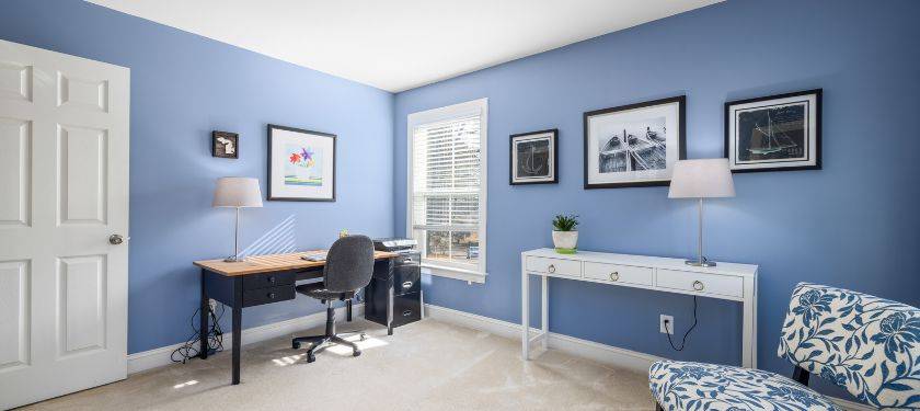
Blue is widely recognized as one of the best office colors for productivity. It promotes:
- Mental clarity
- Focus
- Calm energy
Ideal for:
- Accountant offices
- Tech companies
- Engineering teams
- Administrative areas
Blue tones help people stay engaged and reduce stress during long periods of concentration.
Greens – Restful, Balanced, and Stress-Reducing

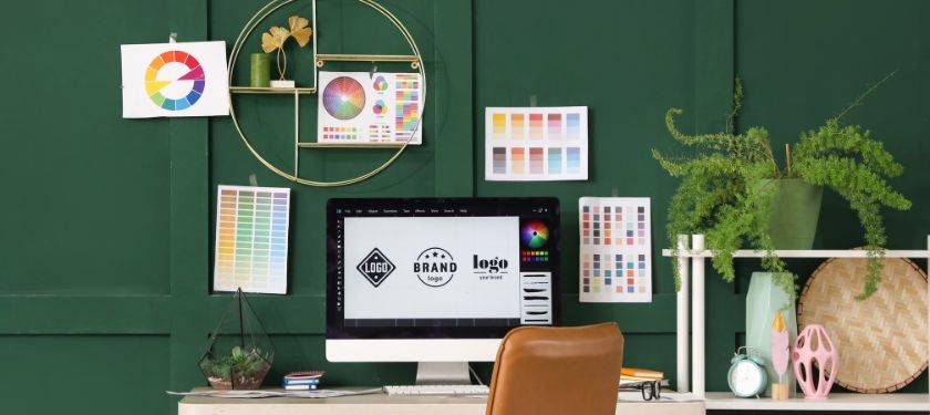
Green is associated with stability and harmony. It is known for reducing eye strain, making it perfect for work environments requiring long hours.
Ideal for:
- Conference rooms
- Open workstations
- Reception areas
Greens make a workspace feel fresh and natural, supporting wellness and calmness.
Yellows – Energizing and Creativity Boosting
Yellow is known to boost creativity, optimism, and innovation. It’s one of the best choices for companies in creative fields.
Best used in:
- Collaboration rooms
- Brainstorming spaces
- Marketing and design departments
Use yellow in moderation—too much can be overstimulating, but in the right amount, it promotes excitement and big ideas.
Neutrals – Modern, Clean, and Professional
Neutrals like white, gray, beige, and taupe remain staples in modern office design. They convey professionalism and provide a clean backdrop for brand colors or accent walls.
Use neutrals for:
- Executive offices
- Hallways
- Areas needing flexibility in decor
When combined with strategic accent colors, neutrals help unify the office design without feeling bland.
Reds and Oranges – High Energy with Caution
Red and orange can increase energy and motivation, but they must be used carefully. These colors can be stimulating and even stressful if overused.
These tones are best applied:
- As accent walls
- In collaborative breakout rooms
- In fitness or wellness areas
A little red or orange goes a long way in activating energy without distracting employees.
Choosing the Best Office Colors for Each Department
Every area of a workspace has a unique purpose, so your color strategy should reflect how employees use each space.
Workstations and Desks
Goal: Focus, productivity, calm
Best colors: Soft blues, muted greens, cool grays
These shades support concentration and help reduce distractions.
Conference Rooms
Goal: Collaboration and communication
Best colors: Balanced neutrals, soft greens, mild blues
These colors create a calm and professional environment perfect for meetings and presentations.
Creative Departments
Goal: Innovation, inspiration, idea generation
Best colors: Yellows, corals, energetic accents
Bright colors can stimulate creativity and boost enthusiasm.
Reception and Waiting Areas
Goal: Warm, inviting first impression
Best colors: Modern neutrals, soft greens, warm accent tones
These areas define your brand experience, so color selection matters.
Break Rooms
Goal: Relaxation and mood reset
Best colors: Soft greens, warm neutrals, light blues
Light, easy-going colors help employees unwind during breaks and return to work refreshed.
How Color Affects Employee Mood and Performance
Beyond productivity, colors influence how employees feel throughout the workday.
- Warm tones boost energy and enthusiasm
- Cool tones increase calmness and focus
- Earth tones create grounded, approachable environments
- Bright colors generate excitement and creativity
Understanding these emotional responses helps guide the best color palette for your company culture.
Incorporating Brand Identity Into Office Color Design
One of the most effective ways to use color in an office is by incorporating branding elements. This reinforces company identity and creates a polished, cohesive environment.
Use brand colors in:
- Accent walls
- Logo backdrops
- Reception areas
- Conference rooms
- Hallways or feature zones
The key is balance—brand colors should enhance, not overwhelm, the workspace.
The Speese Painting Approach to Designing Productive Offices
At Speese Painting, we work closely with Michigan businesses to create workspaces that are functional, inspiring, and aligned with company objectives. We consider:
- Company culture
- Type of work performed
- Lighting and window exposure
- Workflow and department layout
- Long-term durability and maintenance
Our team uses premium commercial-grade coatings that withstand daily wear and look professional for years.
Final Thoughts
Creating a productive work environment isn’t just about furniture and layout—color plays a significant role in shaping employee performance, creativity, and well-being. By understanding office color psychology and choosing the best office colors for each space, your business can create a workspace that supports success on every level.
Speese Painting helps Michigan businesses elevate their office environments with strategic color selection and professional commercial painting services. The right palette can transform how your team works, collaborates, and feels every day.
FAQs – Office Color Psychology
Blues and greens are the top choices for enhancing focus, reducing stress, and supporting daily tasks.
Warm tones increase energy, cool tones create calmness, and balanced neutrals bring stability to the space.
Yes—strategically placing brand colors strengthens identity and creates a cohesive, professional look.
In moderation, yes. Bright colors like yellow or orange are perfect for creative or collaborative areas.
What Homeowners & Business Are Saying About Us Reviews and Testimonials


